Still More Chinese Mobile UI Trends

Since 2014, I’ve written an annual essay cataloging the distinguishing characteristics of user interface and product design in China. I’ve analyzed the unique approaches designers and engineers there solve problems.
The Year of the Chicken is upon us, which means it’s time for the third and final installment.
Why final? In mid-2016, I left the WeChat team and returned to the US. Though I still remain a follower and user of Chinese software, from my current vantage point, I’ll no longer be able to report well on the topic. In fact, even a month or two after leaving, I felt the entire tech landscape in China had already shifted significantly.
As before, this year’s anthology covers a mix of the latest trends and things I just hadn’t noticed until now.
Though long, this article is not meant to be exhaustive, only the “delta” to previous installments. If you’re new to this topic, I suggest starting with the 2014 and 2015 posts. There, I cover some of the major themes that are skipped here.
So for now, without ado, enjoy!
CONTENTS
- Screenshot as Gesture
- The Rise of “Headlines” Apps (and, every app adds headlines)
- People’s Daily Inches Back To Your Homepage
- WeChat Mini-Programs: Theory vs Pratice
- The Rise of Live Video Apps (and, every app adds live video)
- The Tao Kou Ling, (or, how to get around your app being blocked)
- The Logistics Bar
- Android Advances
- Super Search Bars
- Conclusion
Screenshot As Gesture
It always seemed, anecdotally, like my friends in China paste a lot more screenshots than those back home. Any time there was an interesting bit of conversation, a headline, a post on social media, they’d end up sending it as a screenshot.
It’s no wonder that many apps have have a clever bit of UI that helps with this. If a screenshot or photo is on the device’s camera roll within some short time threshold, the user gets a one-tap way to send it into the current context:
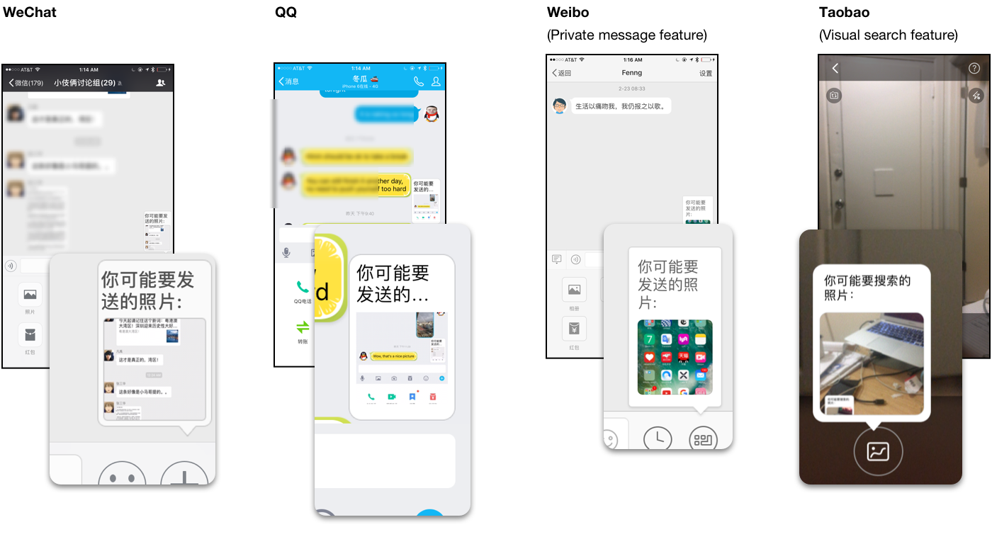
3rd party browsers like UC Browser and QQ Browser have excellent full-page screenshot tools with annotation, as does Xiaomi MIUI and Smartisan OS (on a system level). Even on the desktop, there are screenshot tools built into chat and email clients and stand-alone tools like Jietu.
Conversely, many apps, when they detect a screenshot has been taken of their content, pop up a thumbnail with an option to launch into annotation, sharing, or other actions from within the app. Some present the option to share or give feedback, while Taobao implores you to also send a “Buy” link via “Tao Kouling” (see later) after you send your friend the screenshot:
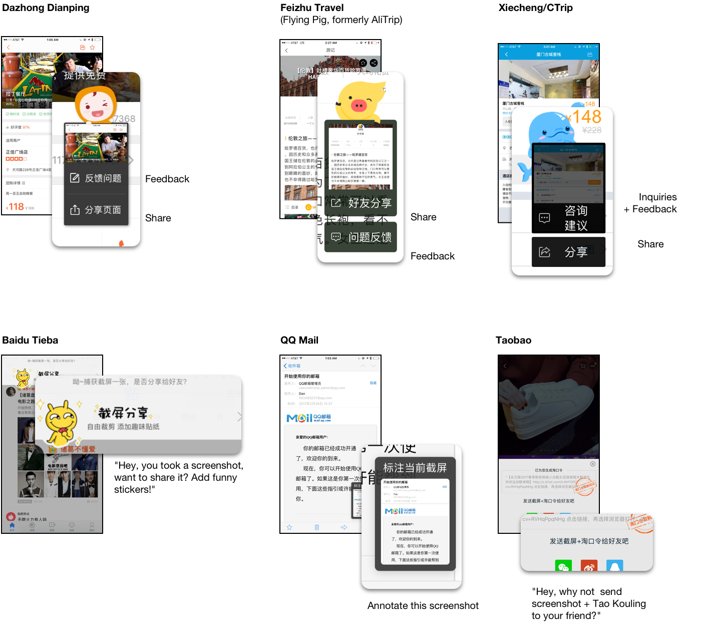
There are a few reasons an app might do this. One is that the system “share” sheet, by default, may not include apps the average Chinese user will actually want to share to (WeChat and QQ). Using a custom share UI fixes that, and also gives the app developer a space to promote any in-app social features or also-ran messaging app they own. If they share into WeChat or QQ using the official SDK rather than the system-level intent, the app gets more control over the message and can also include an attribution linking to the App Store.
But a more important reason, particularly for ecommerce apps, is to give them a chance to add a link or QR code so that the recipient can actually get to the thing being shared. Taobao calls theirs 长图 (chánɡ tú, long pictures), and puts together all the pictures in the original posting.
Users who recieve one of these pictures are already trained to long-tap them and choose “Recognize QR Code” (识别二维码, shíbié èrwéimǎ), an action supported by most messaging apps and browsers.
The Rise of “Headlines” Apps (and, every app adds headlines)
For while, in China, to get your news, you had a few choices:
There’s always Weibo, like a richer and more tricked-out Twitter, which fell out of fashion, then more recently had a comeback.
Then you’ve got the apps for your traditional mainstream outlets, whether it be individual newspapers or sites like Tencent News and Sina.
Then there were the social newsfeeds, mostly focused around your friends’ own personal updates, like WeChat’s Moments and QZone. But while these feeds allowed posting links and articles, their posting UIs were biased towards non-link content. Also, they were never algorithmic. They always showed, in chronological order, exactly what your friends had happened to post, far from being that carefully-tuned slurry of links, personal updates, and targeted ads that users in the US rely on Facebook for.
And lastly there were the Subscription Accounts on WeChat. They allowed news to come directly to your inbox. You had to subscribe to an account individually, then any time they issued a new post (up to once per day), it would appear in the “Subscriptions” folder. This became the dominant use-case for Official Accounts/bots in the app, with, in one study, 39% of surveyed users using the feature daily.
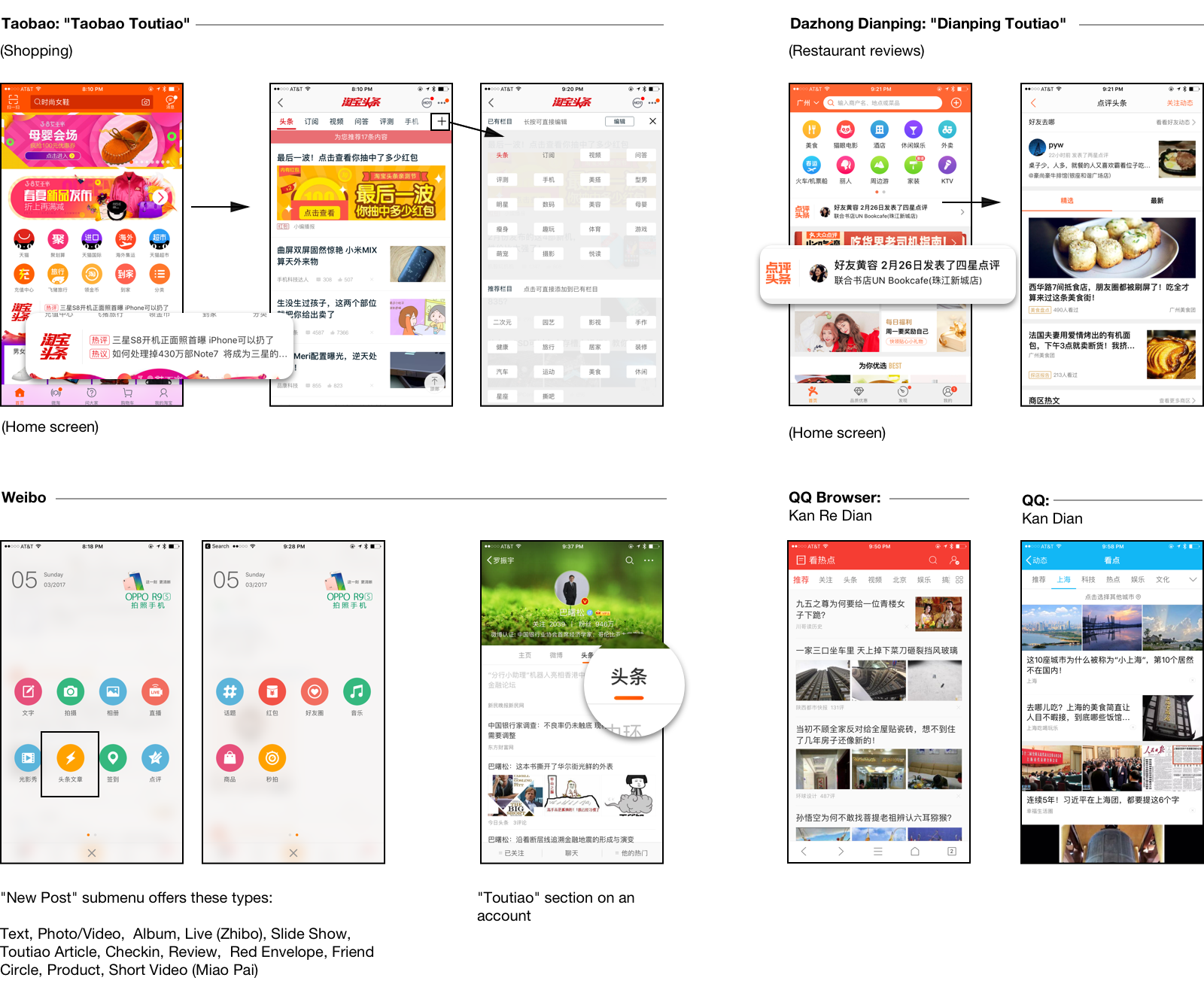
This last year, a new category of news apps has emerged as a challenger. They promise personalized news – both based on the topics you select (a la Flipboard), as well as machine learning algorithms. The leader of the pack is 今日头条 (Jīnrì Tóutiáo, Today’s Headlines). Now valued at over $500 million, it features a few user interface hallmarks that have since made their way into lots of new copycat apps as well as appropriated by existing news apps:

We can see a few good ideas here:
-
High content density with minimal real estate given for each story: just a large-print headline and sometimes a few small thumbnails, seldom a full-bleed picture. These are apps designed to be run in low-bandwidth situations – they even pre-download as much as they can when on wifi for users who don’t want to waste precious data.
-
Similar topic-selection UI. Along with your typical news categories – sports, international affairs, finance – they also always include categories like 美女 (měinǚ, beautiful women) and 段子 (duànzi, funny stories). These apps use your location to add a “local” category, as well as target ads to you.
-
Clean, fast reading UI, with similar-looking bottom bars allowing users to comment and share.
-
In addition to recommended news, these apps have their own kind of “subscription accounts”. These let you see everything from a given publisher in an inbox-like format (different from the main view). This is no doubt directly competing with the same feature of WeChat. Jinri has 头条号 and the beginnings of an open platform. NetEase offers 网易号. Even Baidu, which has started pushing news in its main app, is offering something called 百家号. UC calls theirs 订阅号, same as WeChat. In English (for their India launch), it is branded as We-Media.
So prevalent is this trend that not only have existing news apps have re-designed to more closely resemble the “toutiao” apps, but so have those in other genres.
The shopping apps, already having made various content plays, now all have “toutiao” sections. So have QQ and QQ Browser. Weibo has made “toutiao” one of the now 14 types of posts you can make on the service. These articles open up instantly and display in a clean, full-screen format, much like the Google AMP and Facebook Instant Articles features that share the same lightning bolt emblem.
People’s Daily Inches Back To Your Homepage
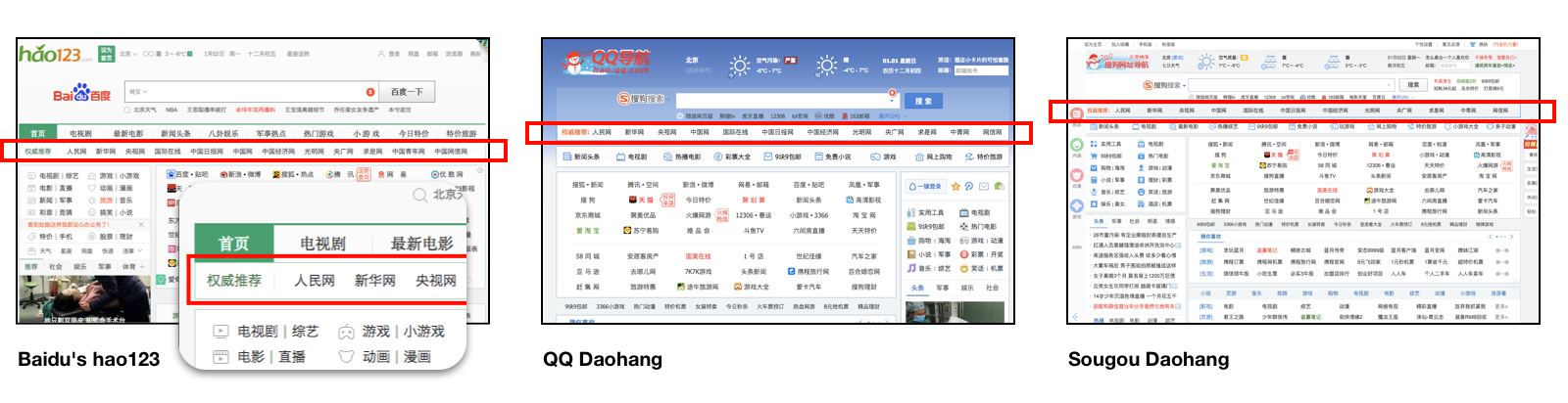
Many major internet companies offer a kind of portal page (导航) with an enormous grid of links to hundreds of the top sites. These are worth an entire design study on their own.
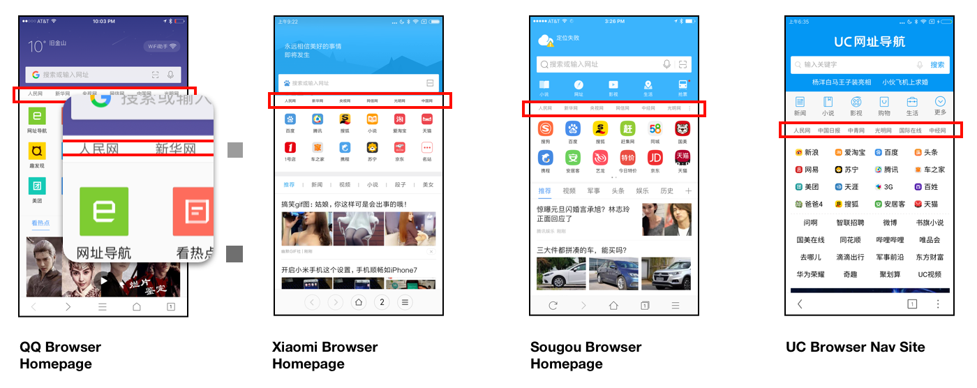
Since June, these pages have been required to add a row of mandatory links at the top to government-run websites. On desktop sites, they’re called out as 权威推荐 (quánwēi tuījiàn, recommendations from the authorities). These include The People’s Daily, Xinhua, CCTV and all the usual suspects.
In China’s many third-party mobile browsers, they’ve been added to homescreens. But here, the designers have made these links tiny and gray as possible. They might be mistaken for a smudge on your phone screen:
On major news sites and portals like Sina, NetEase, and QQ.com, the first few headlines are always about Xi Jinping doing something or other, which on the surface is not dissimilar from headlines about the President on the front page in the US. But after a while of getting in the habit of reading the news in Chinese with my coffee, I’d realized the wording was suspiciously similar between sites, and that they’d report on the most mundane developments and breathlessly repeat the latest catchphrases unironically (in stark contrast to CNN’s chyron).
These headlines have long since been absent from many of the places the average Zhou actually gets their news – from Weibo, from WeChat and QQ’s subscriptions views, from those apps’ news feeds, and naturally from just about any news outlet even slightly smaller or narrowly-focused. These places are kept clean via self-censorship but do not include this content.
I’d mentioned before that this year, a new genre of news recommendation apps had given social media as well as mainstream news apps a run for their money. Sure, social media and messaging apps are one thing, but wouldn’t it be a shame if apps explicitly billed as news apps shirked such an important patriotic duty?
Jinri Toutiao handles the matter tactfully. In the first tab of personalized recommendations, the first item is propoganda, but unlike on the mainstream news portals, they’ve got a special way to call this out:
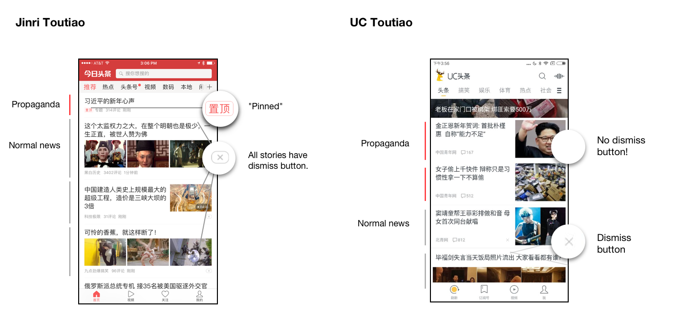
In addition to the telltale byline, there’s a badge. Here, they use the word 置顶 (zhìdǐnɡ) – the same used in chat apps for that nifty feature that lets you pin a conversation to the top of your inbox to keep it handy. That’s funny, I don’t remember pinning this headline; I guess someone’s already made that call for me!
In UC头条, UC Browser’s spin-off news app, as well as others, they just show this content in the prime slots. The only visual differentiator, other than the byline, is the lack of a dismiss button.
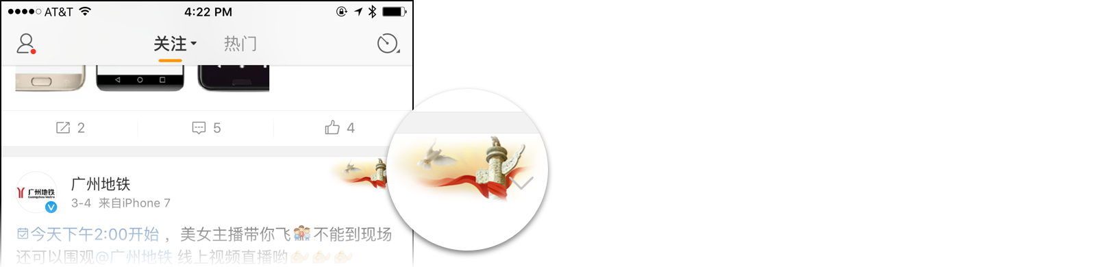
Though Weibo never inserts such stories into anyone’s feed, they’re heavily featured in the 热门 (rèmén, trending) section. Every post from a government account, at any level from central to munincipal, has a watermark in the upper-right depicting a 华表 (huábiǎo), a traditional ornamental column:
WeChat’s Mini-Programs: Theory vs Practice
On the morning of December 28th, 2016, Allen Zhang emerged before an expectant crowd at WeChat’s 公开课 event (akin to Facebook’s f8 or Google I/O). A year earlier at the same event, he’d pre-announced 小程序 (xiǎo chénɡxù, mini-programs), then termed 应用号 (yìnɡyònɡ háo, app accounts). Finally, third parties could build native-like apps within WeChat.
In the intervening months, tantalyzing bits of news and screenshots had been dropped. During the private beta launched a few months earlier to only 200 developers, the API docs and IDE had leaked so far and wide that the company simply gave up and put them up on the official site, despite keeping the beta closed. We’d learned the apps would use their own markup and style language – WXML and WXSS, respectively – and be powered by a beefed-up version of WeUI, WeChat’s own mobile UI framework. Aside from things like user profile, payment, sharing, and camera access – long available to web developers inside WeChat – there would be a whole suite of new APIs to make these experiences even more native.
Though the technical details had been understood, nobody’d actually used the feature in the app or seen how it would integrate into the product.
In his keynote, Zhang opened with a rather lengthly pre-amble. It was a mix of hype-building and expectation-setting well worth translating and analyzing.
He began by expounding on a catchphrase he uses to encapsulate a core philosophy, 用完即走 (yònɡ wán jí zǒu), meaning, use it and get out:
I said last year that a good piece of software should get the user in and out as quickly as possible. Lots of people in our industry dismissed this – “easy for you to say!” – given WeChat’s strong user numbers and stickiness. So let me put it this way: People designing other products are always trying to think about how to keep users, how to make them not want to leave.
It’s pretty simple. Follow my logic. Any tool’s goal is to increase their users’ efficiency, to give them the most efficient means to accomplish their task. That’s the tool’s mission in life. WeChat is a tool. Therefore, WeChat’s goal is also to help users employ the most efficient means to accomplish their task. What’s the most efficient means? The one that takes the least time! So the user can get out of the product and do other stuff, rather than stick around. That’s what I mean by “yònɡ wán jí zǒu”.
He explained why he emphatically does not think of WeChat as a platform:
During our internal training, a colleague once asked me “What’s WeChat’s strategy?” To this, I simply replied “WeChat is a tool, so we always try to figure out how to make a better tool.” But in my colleagues’ minds, WeChat isn’t just a tool; it’s a platform.
It’s hard enough to just be a tool! A tool is not such a lowly thing. Primitive man’s first step in evolution was making tools. Most of the products we use are, in essence, tools. But not all of them are good tools. There’s the rub. Making a good one is hard. If we’d set out saying “let’s make a good platform”, how do we know what that even means? What does that look like?
But all good tools have a single attribute in common: they increase the user’s efficiency. Yònɡ wán jí zǒu. That’s all there is to it.
This steadfastly “tool-first” mentality may seem like odd positioning, but it is exactly what one would expect from someone who had spent the entire previous decade building email clients.
He turned back to the hype-building:
People who know my life know I spent many years coding. I treasure those years. I still regard myself as a programmer today. When you write a program, you enter a new world. Only through a programming language can you take an imaginary product from that imaginary world and bring it into our own.
I think a lot of programmers have the same dream: they don’t just want to write a program, they want to write something that advances the state of programming. Maybe an operating system. Of course, I don’t think we’re good enough to do an OS, but we’ve got an opportunity to advance programming here. So as a programmer, it makes me so proud and excited to be here today.
He reflected back on the changes he saw since his first PC, an Intel 8086, before turning toward the future:
What kind of form will the mobile internet take in the future? What kind of equipment will we use to access the network, or what kind of method will we use to access services? Hard to imagine. Maybe after phones it’ll be glasses. Your whole PC will fit in your glasses. The screen would be even better than your phone’s or a PC monitor, beaming directly into your retina. We’d wear ‘em everywhere.
What kind of OS do you think the glasses would run? In ten years, one should hope the apps you’d use would be totally different from today. I sure hope we don’t have to “install” these apps. It’s just not natural. Not convenient. I hope the way it’d work is you just have to look somewhere, and the app is aready there.
Say I’ve got a lamp in my room, and I want to be able to turn it off or on. I should just be able to look at the lamp and see a virtual switch. I can just control it with my eyes. What is the switch, really? It’s an app. And the app just automatically appeared. You can imagine lots of scenarios like this. Maybe when you go to the park, at the entrance, an app appears on top of the gate to sell you tickets. This is to say, you’ll be able to use your glasses, look at anything, and get at the underlying information (得到背后的信息).
If you think along these lines, you’ll discover, compared to this imaginary future, apps today take a totally different form. Apps are not “WYSWIG”, in the truest sense. Sure, the UI is WYSYWIG, but when we look at real things, it’s not. Everything in the real world has underlying information that we should be able to get at.
That’s my hope for the future of programs. I want programs to be everywhere.
By way of that analogy, he segued into how QR codes, specifically WeChat Official Account QR codes, had replaced URLs in ads, but that it didn’t quite make sense for all of these codes to ask users to subscribe to these accounts as a first step:
The last time I went to the Shenzhen airport, I noticed something funny. Every single advertisement in the airport had a QR code on it. Most of them, I’d say 80%, were WeChat Official Account QR codes. What’s interesting is that in the PC era, these sort of ads would have URLs on them. I was so excited to see that WeChat QR codes had replaced URLs, but there’s one bit I wasn’t so excited for.
When I saw an ad and wanted to understand what they’re advertising, I’m supposed to go “subscribe” to their account first and start recieving their push messages. Quite different from just going to a URL! I don’t think ads should make you subscribe to their account. They should just have a direct link to their service. That’s what mini-programs’ form is suited for. I see an ad, I want to use their service, or get at the underlying information.
The idea may seem strange to us in the West, but to those in China, the idea of directly invoking these sort of rich experiences via QR code is no pipe dream.
Anyone who’s ordered and paid at a Jiumaojiu restaurant or registered at a hospital – and yes, controlled a smart lamp – has already seen the idea in practice. Lots of things could now be put online and automated now that there was finally a frictionless way for users to get at those experiences. These use-cases wouldn’t have stood a chance if the user had to first download an app or type in a URL (much less register or link bank cards)
An entire industry of solution providers had long since come online to help businesses enable all sorts of app-like interactions – mostly using HTML5 plus WeChat APIs – using WeChat’s Official Accounts as the medium.
The WeChat QR codes one finds in China not just on advertisements, but on tables in cafes, vending machines, payment counters, hardware devices are a testament to the app’s success in enabling and popularizing this interaction model.
Yet these experiences had always come packaged in the weird wrapping paper of a “subscription” and involved a couple extra taps to actually get to the app. Now the idea was to eliminate a step and make it less spammy.
You can see the needle Zhang is trying to thread here. On one hand, WeChat Mini-Programs had practically been hailed as the Second Coming by Chinese and foreign press alike. On the other, this was an evolutionary development, a thoughtful optimization to an existing, proven feature (albiet with a new name and evolved tech stack). He’s got to maintain the excitement while setting expectations and put Mini-Programs in context of the overall product vision.
He turned to address the question of why there would be no kind of “app store” for Mini-Programs, no rankings, no recommendations:
Now you might wonder “Why not take the things a user is interested in and give them some Mini-Program recommendations?” There’s a reason we never did that sort of thing with Official Accounts in the past, and we’ll never do it in the future with Mini-Programs.
We did once consider adding machine-learning based recommendations to WeChat, but we realized there was a huge disparity between that and social recommendations. Every day on the Moments news feed, you come across lots of articles [from Official Accounts]. Your friends are actually a kind of recommendations system. If our system were to recommend accounts to you, it would only be based on things you’d come in touch wih in the past. It’s only amplifying what it already knows about you. But suppose your friend posts on Moments and says a new movie is pretty good. Then you might go see it because it was your friend who recommended it, not because you had necessarily watched similar movies in the past. Machine recommendations have no way to account for this. Same goes for mini-programs.
He continued in this manner for a while, laying down the rules: Mini-programs were to be discovered by QR codes foremost, and social sharing second. They’re also in Search and in the profile screens of Official Accounts. They could only send the user messages in very limited circumstances. And no games allowed.
After the event, one could sense a disturbance in the force, as if thousands of Chinese developers suddenly cried out in terror and were suddenly silenced, and then decided not to raise their seed round just yet.
Even with QR codes as the main entry point, users soon discovered, the scanner was specifically programmed to fail if the user imported a photo of a code (something that was quite common for Official Accounts). It’s not enough to have encountered the code online – you were supposed to whip out your phone and scan the code in real life, gosh darn it!
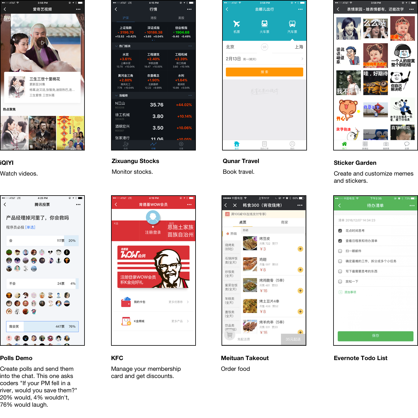
In reality, this dose of restraint came in rather late in the development process. Indeed, most of the mini-programs developed by high-profile partners seemed like fully-flesched-out conventional native apps. The fact that this was achievable at all shows the power of the platform, but stands in contrast to the limited scenarios the feature was designed for. News apps, travel-booking apps, podcast clients, sticker/meme apps all were furiously shared around and searched for by name:
In the days following the launch, tech nerds and potential adopters of the feature got mixed messages between what the launch partners had shipped, what the press had built the feature up to be, and the very limited scope and use-case they were actually intended for. Some asked “Why isn’t there a mini-program store? I’m having such a hard time discovering these.”
Sticking to their guns, the conference issued several posts trying to further emphasize the message imparted in the speech: this feature is meant for lightweight purpose-driven apps, meant to be discovered offline. If you’ve never discovered a mini-program, why, they’re all around you!
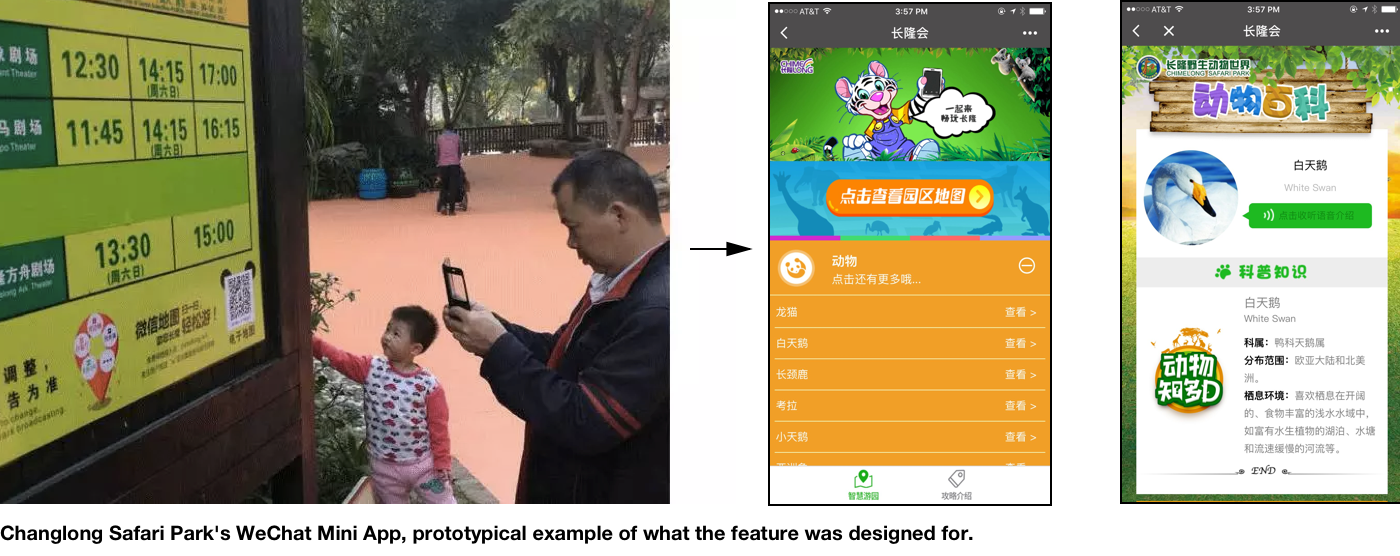
Take this one from Changlong’s Safari Park in Panyu, just a few miles south of WeChat’s offices. You scan the code, and you get a rich, interactive map and guide that you can refer to during your day at the park:
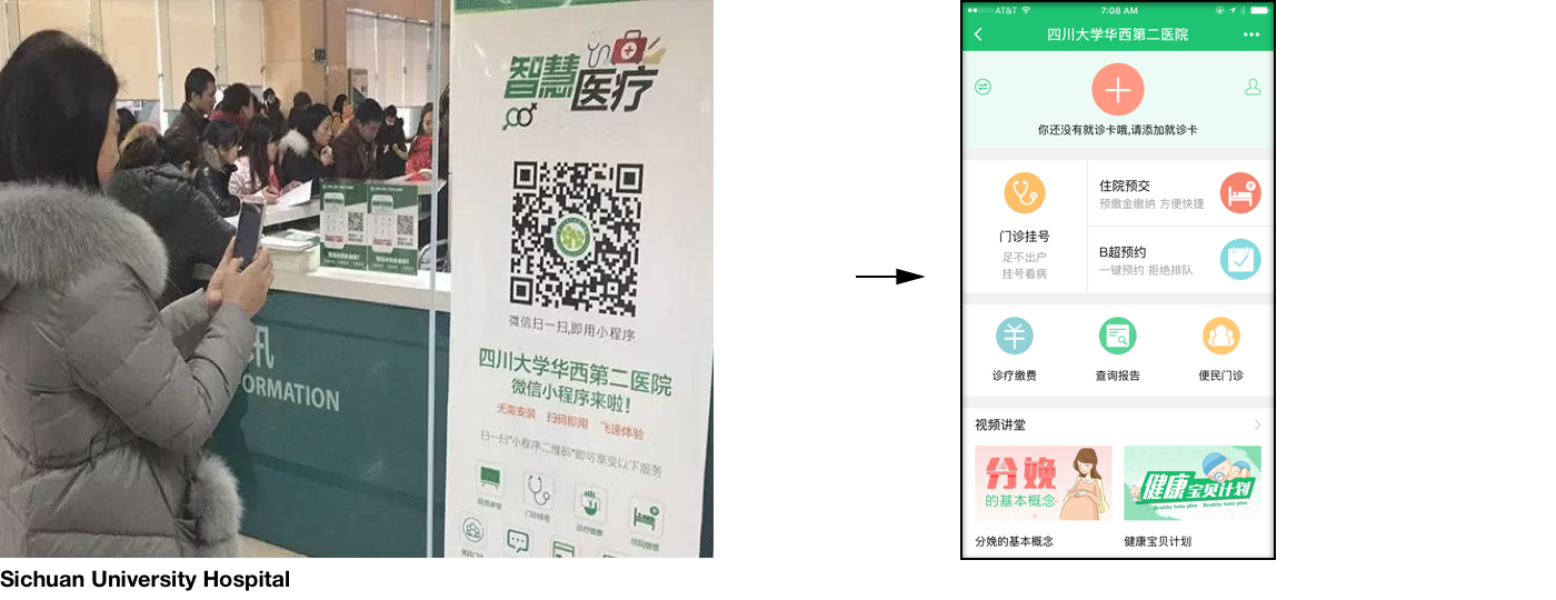
Or this one from Sichuan University Hospital, allowing patients to register, check records, pay your bill, and more:
Still, a month in, WeChat’s mini-programs are a technical triumph, but their commercial success is uncertain. Critics are still scratching their heads. Having seen some of these misguided initial attempts at launching mini-programs shut down, a pundit at Huxiu even called it a nightmare. Then again, Allen Zhang doesn’t worry much about what his critics say.
In ten years, it is not a stretch to imagine that the way most users interact with info on their phone will resemble neither the mobile web nor our current native apps, be it mini-apps or bots.
The Rise of Live Video Apps (and, every app adds live video)
In the past year, a spate of live video broadcasting apps has taken the limelight. The major contenders are YY, 斗鱼 (dǒuyú), 花椒 (huājiāo),and 映客 (yìnɡkè).
These apps are all quite similar. You browse a gallery of thousands upon thousands of video streams to watch. It seems 90% are girls, 5% are video games, and 5% are girls playing video games.
While watching, you can see the comments from fellow voyeurs wash by dàn mù style. These apps also make heavy use of user ranks and points, covered in the last essay. As if this didn’t already sufficiently presage the Black Mirror-esque future that awaits us, you can buy virtual gifts for the person broadcasting, or, when writing a comment, pay for a membership so you can make your text more visible. All of them support a swipe gesture for flicking through streams.
Typically, when analyzing a new category like this, I could draw all sorts of distinctions in how each product is trying different angles. However, these apps all seem like exact clones of each other (to say nothing of some of their users).
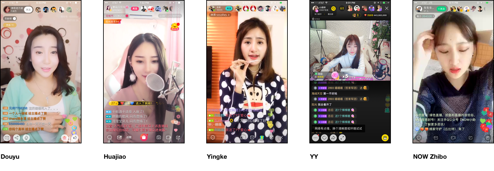
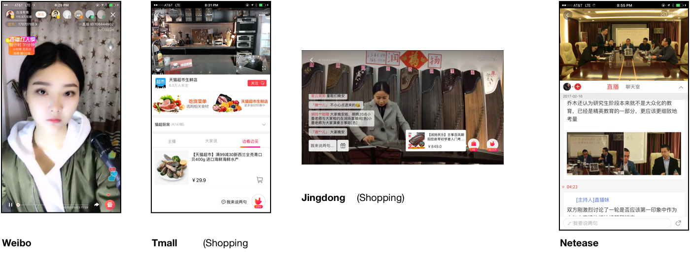
Apps across other genres, too, have rushed to incorporate live video toward different ends. It seems just about everything from shopping apps (providing a kind of crowd-sourced QVC), to news apps, to social networking apps has found some excuse to add a 直播 (zhíbō) tab:
The Taokouling (or, how to get around your app being blocked)
If you click on a link to an Alibaba-controlled site like Taobao or TMall inside a Tencent-controlled messaging app, you’ll get an error telling you the page has been blocked. This is the same mechanism the app employs to block users from visiting pages from accounts violating terms of service, or content censored by the powers that be.
Why is this? Depending on who you ask, it was Ali who started it. When users opened links to their sites in these apps’ browsers, they’d detect the user agent and put up a dialog telling users to “Open in Safari” (or Chrome). If true, this was a poor experience. At any rate, now they’re blocked.
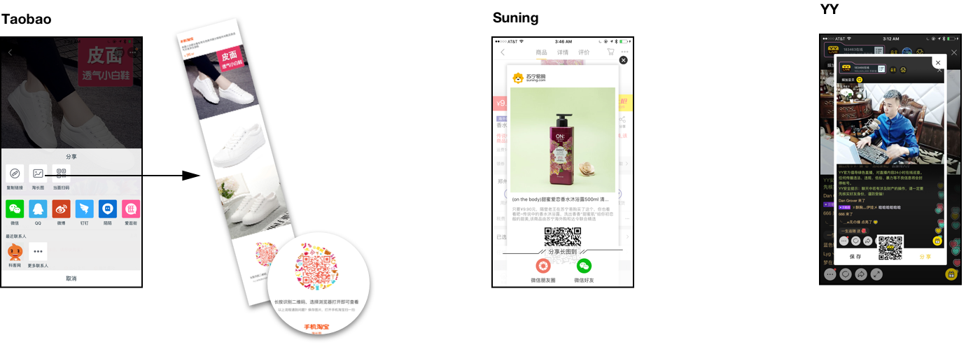
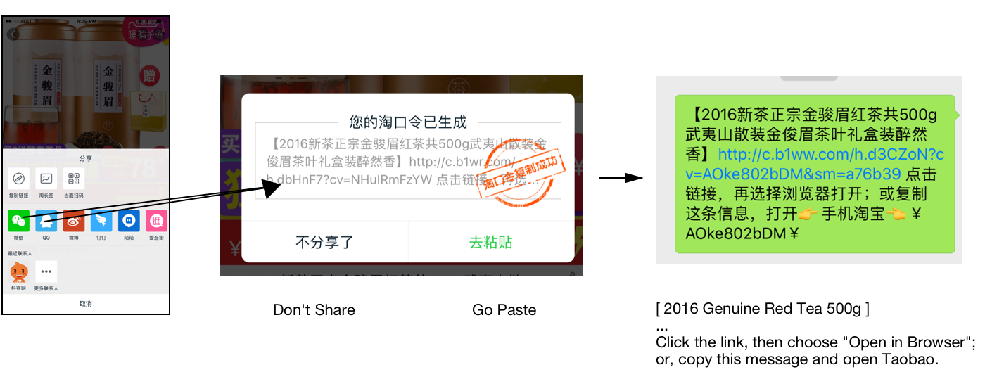
How does Taobao handle this? Enter the 淘口令 (táokǒulìnɡ). Kind of like 绕口令 (ràokǒulìnɡ, tongue twister).
If you tap “Share” in Taobao and choose WeChat, they don’t open it directly with a pre-filled message (as with other apps it plays nicely with). Instead, Taobao shows you a dialog with instructions, with a red stamp on it, as if it were a top secret dispatch.
How does it work? After you agree, Taobao pre-copies the snippet to your clipboard, then launches the messaging app using a generic (non-deep, non-intent) link, and then expects you to paste what’s been copied. The instructions in the snippet tell the recipient to copy the entire message to the clipboard and then open Taobao. Taobao reads the clipboard and redirects them to the appropriate page. Then the heist is complete!
Other products support something similar:
- What do they call it in T-mall, the shopping site represented by a cat? Why meow kou ling (喵口令), of course!
- It’s 吱口令 (zhī kǒulìnɡ) in Alipay.
- The live video app Huajiao instructs users to copy and paste a 椒口令 (jiāo kǒulìnɡ), though I’m not why they need it.
The Logistics Bar
I like how every shopping app has the same row of icons in the “me” tab. It shows the rough status of all your various impulse buys at a glance.
Each of these “stages” can be badged to show the number of items in each (mine are unbadged below because I took these screenshots after moving back to the US).

In Amazon, you’re supposed to tap “My Orders” and then inspect the status of each item. This is way better if you have a lot of small items in transit.
Android Advances
In the US, when buying an Android phone, one is advised to get a plain vanilla Google-branded phone to avoid all the half-baked features and pre-installed apps the OEMs inevitably include in their fork of the OS.
But in a country with no Google, all Android phones run OEM forks. They range from bad to pretty good. Let’s look at some new developments on the good ones.
MIUI 7
Xiaomi released a few neat features in their last update.
手机分身 (shǒujī fēnshēn) lets you have entirely separate user accounts on your phone, authenticated by fingerprint if necessary.
Another 应用分身 (yìnɡyònɡ fēnshēn) lets you make multiple sandboxed instances of the same app. This is handy for when you want to check multiple accounts on a service that doesn’t make switching easy.

Smartisan
Smartisan OS, (锤子, chuízi, hammer, in Chinese) showns what mobile UI would be like if Flat UI never happened. Every detail is beautifully designed in vintage Apple 2012 style, with drop shadows, textures, and gradients galore. One might expect this if Scott Forstall had pulled a Hugo Barra and joined a Chinese company (rather than become a Broadway producer). But it was, in fact, started by the outspoken Luo Yonghao, who made his fortunes as a celebrity English instructor.
No small detail has gone unconsidered in pursuit of its unique kind of hyper-skeuomorphism. The launcher puts every app icon on a tile that can be pressed down as if a single physical button. Seeing app icons already shifting to the flat UI trend, Luo even painstakingly commmissioned skeuomorphic-style icons for popular third-party apps. The system clock app shows differing second hands between time zones and the music app even depicts albums as vinyl records.
The last update added OneStep, an app switcher featuring novel way of transferring data between apps. It lets you drag individual objects within the app into another app, which required persuading over 150 third-party developers to add support for the feature. It also solves the problem of not being able to copy and paste a substring of a message within a messaging app with a feature called “Big Bang” that blows up the selection into magnetic poetry tiles, making them easier to manipulate.

Super Search Bars
I’d covered before the way Chinese apps handle fuzzy matching in search, but it’s worth discussing search further.
Many apps provide a kind of “universal search” similar to Mac OS’s Spotlight or Ubuntu’s Unity dash. They’ve all adopted similar visual language in their null states for showing the user the sort of things they can search for:
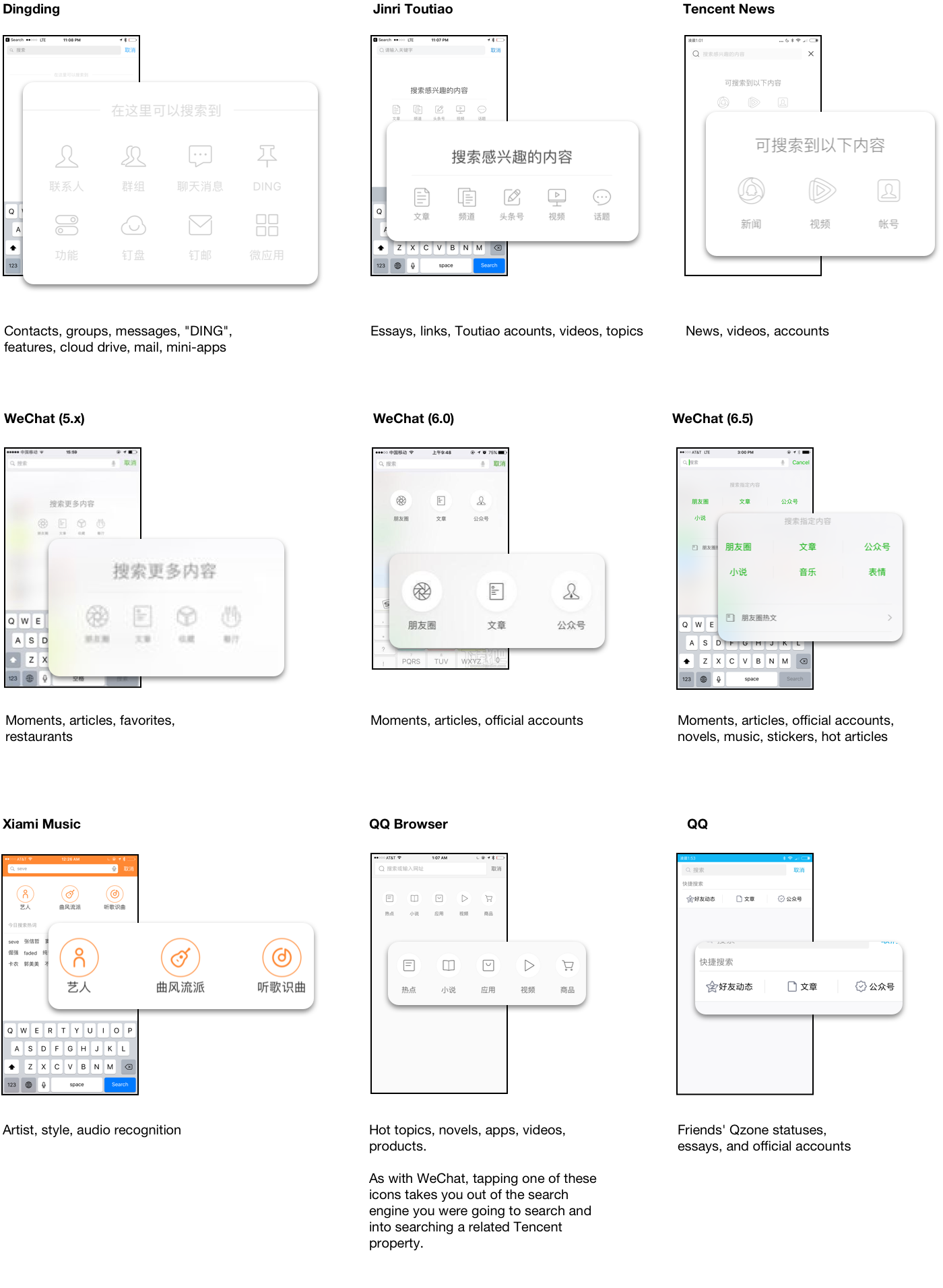
Aside from the visual design of the null state, there are a few notable things about the way search is done in these apps.
First, they usually do not require network – your own content (be it contacts, chat transcripts, or archived/favorited messages) is always aggressively cached and indexed locally. Beyond that, though, some even force an explicit separation between the two.
In WeChat’s case, searching non-local content (or content the user never specifically added) explicitly requires an extra tap. This can make finding Official Accounts or searching for articles cumbersome, but in daily use, makes the app feel utilitarian and fast.
Over several versions, despite this strict separation of church and state, WeChat has added an increasing amount of discoverable content via the search null state, like music, novels, and articles – resembling similar moves in Chinese 3rd party browsers. But unlike other apps, the non-local content itself never appears in search results or on the null state initially.
Second, and more interestingly, the app’s own feature names are included in local/instant results:
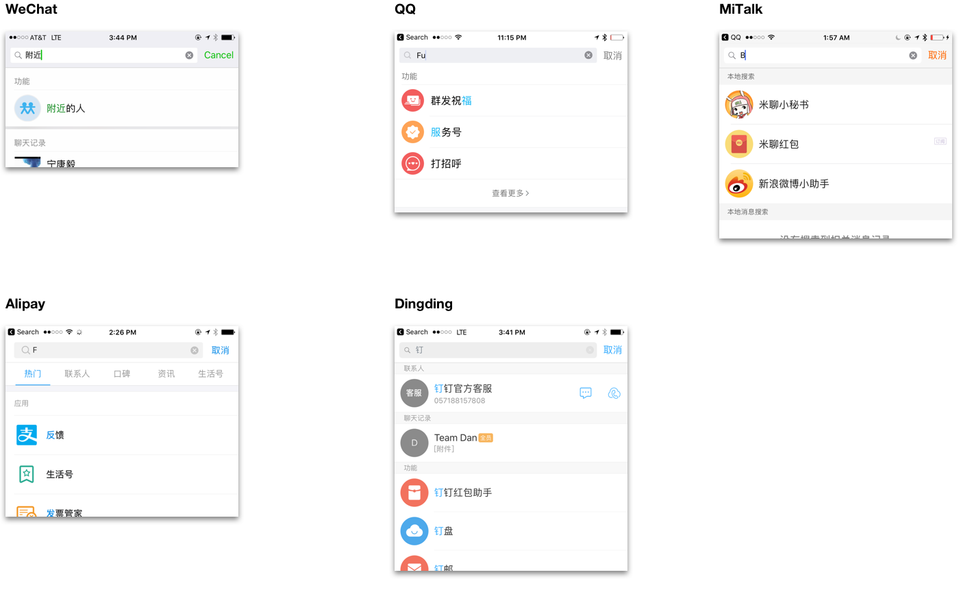
I’d previously called out the the indeterminate red badge as a technique pionered in Chinese apps to ease discovering the high number of features apps there tend to pack in. Putting feature names in search is another such affordance. When a feature in an app is a couple levels deep, search can sometimes be the fastest way to get at it.
Conclusion
That’s it for now!
What I’ve covered in this installment just scratches the surface of the immense amount of activity going on in the Chinese mobile ecosystem, which on iOS already has surpassed the US in revenue.
I’m done talking about UI in China, but I have a few posts coming up on life there. I’m also excited about what I’m building these days and will have more to say soon!
Footnotes
To fill in
Acknowledgements
To fill in